Project Summary
As one of the top universities in the nation, the University of Washington (UW) not only offers great education, but also a place full of organizations and events that give people the opportunities to pursue their educational or recreational goals. With so many organizations and things to do around the campus, however, students have difficulty finding events that they could attend. There are so many events occurring every day, but due to time constraints of the students’ schedules and different organizations possessing different localized knowledge, students cannot efficiently search for events that interest them and that they can attend.
Thus, we decide to design a mobile app for helping students find their favorite events on campus.
User Centered Design
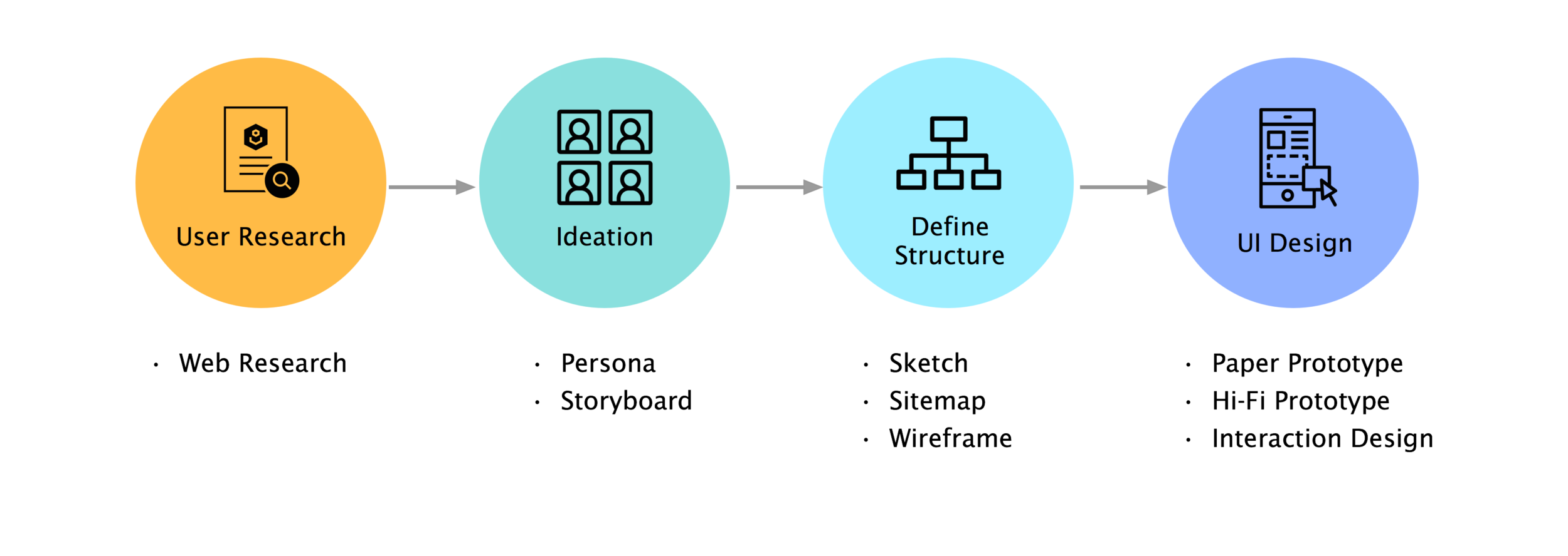
UX Process
Web Research
As one of the top universities in the nation, the University of Washington (UW) not only offers great education, but also a place full of organizations and events that give people the opportunities to pursue their educational or recreational goals. With so many organizations and things to do around the campus, however, students have difficulty finding events that they could attend. There are so many events occurring every day, but due to time constraints of the students’ schedules and different organizations possessing different localized knowledge, students cannot efficiently search for events that interest them and that they can attend. To further understand and create a solution for this challenge, we investigated current systems, event advertising methods, and the reasons why people attend events.
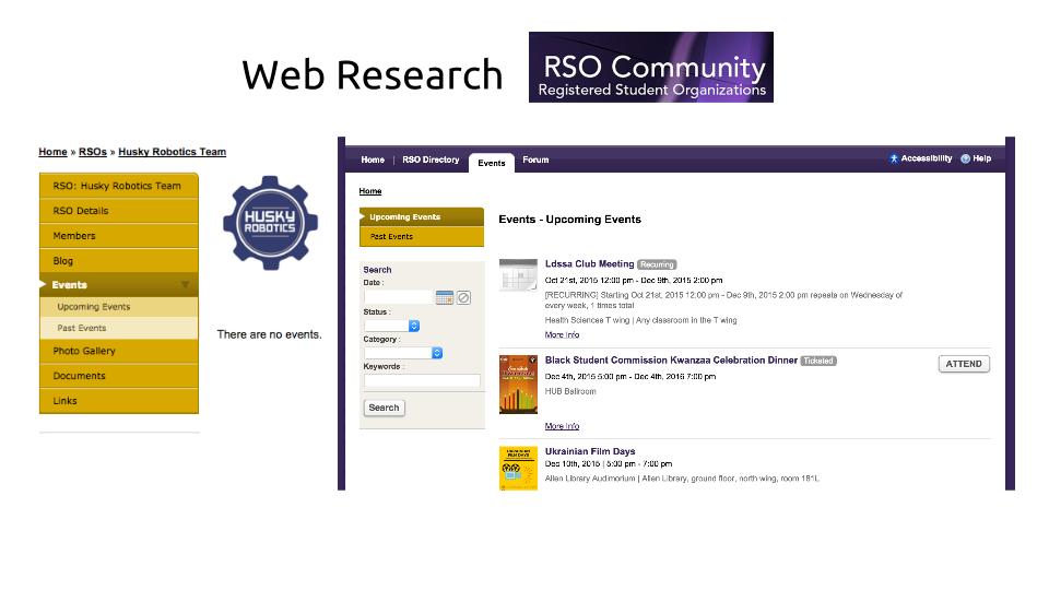
Current UW event reservation website
Bad User Experience
No mobile Web/ App
No search/ filter function
No calendar
Persona and Storyboard
With the research findings, we were able to identify our audience being UW students with smart phones. Taking this into consideration, we developed personas of different personalities and goals that would be interested in our application. Establishing each personas’ goals, motivations, pain points, and technological background allowed us to create in-depth scenarios.
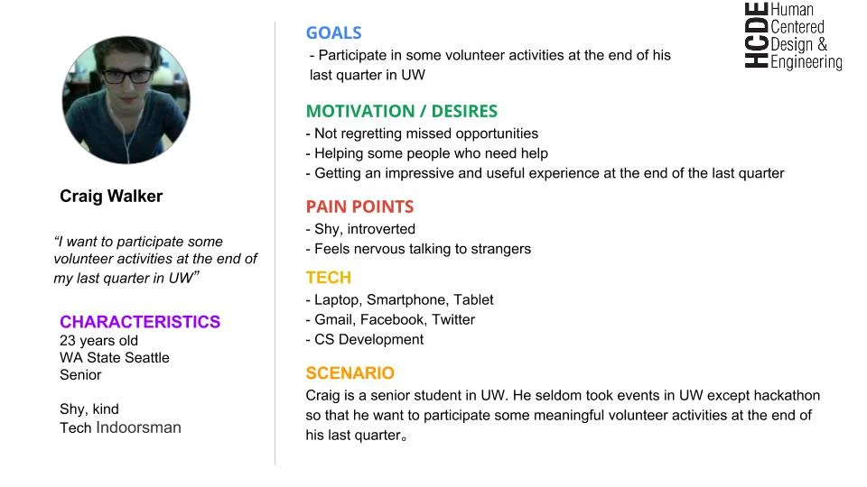
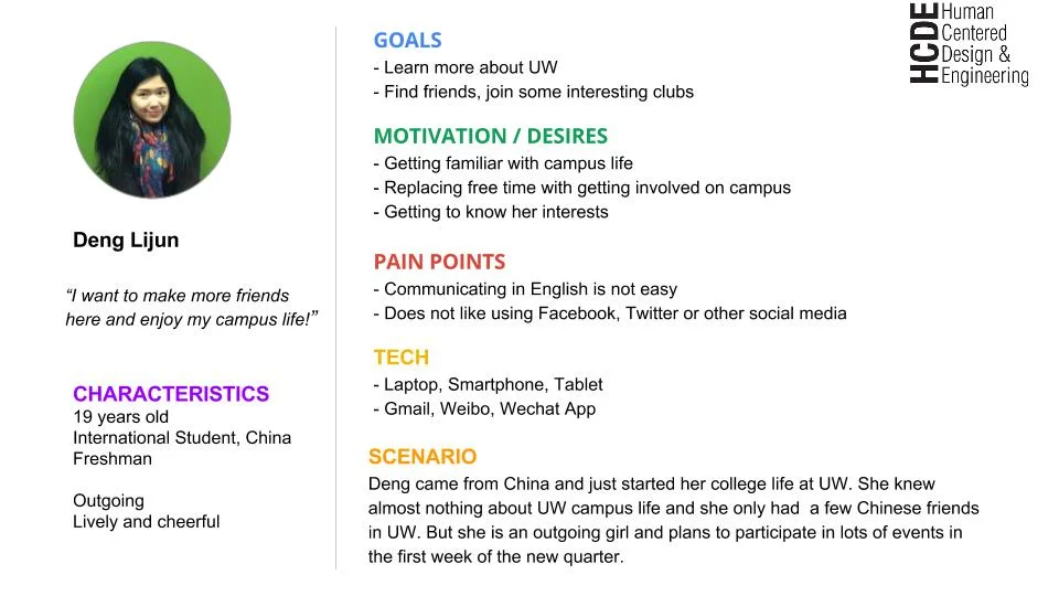
Persona 1 & 2
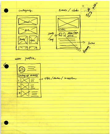
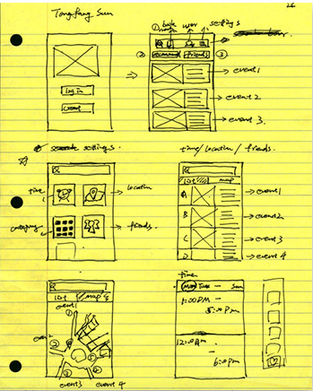
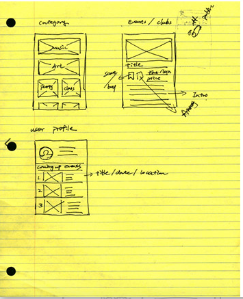
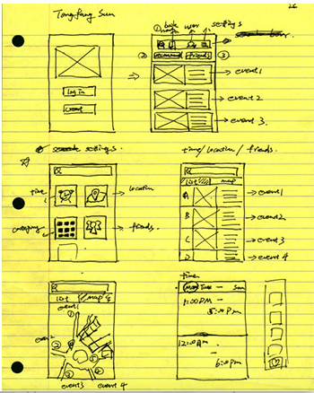
Sketch
We took the scenarios we had made previously and designed ideas that would work for different types of people. We got ideas to incorporate a time feature for busy students, a map feature for students to discover events around them, and a tags feature to allow students to find events or clubs they would be interested in. First, we sketched ideas for the UI individually. We then collaborated to share our ideas, and brainstormed more design sketches as a team. This process allowed our group to hash out a ton of great designs and bounced ideas off each other that we thought would particularly successful for our intended users. The sketches directly helped us create our storyboards of how users would interact with our application.
Sitemap & Low fidelity Prototype
According to the sketches, we create the UI sitemap (information architecture). The process of getting to that screen was in the back of our minds as we created our sitemap. Creating the sitemap gave us a better understanding of the information architecture of our application, the relationships between all the pages including similarities and differences.
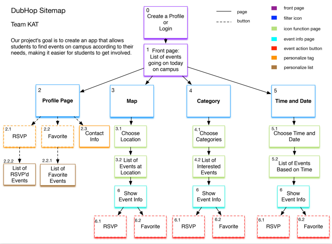
Sitemap
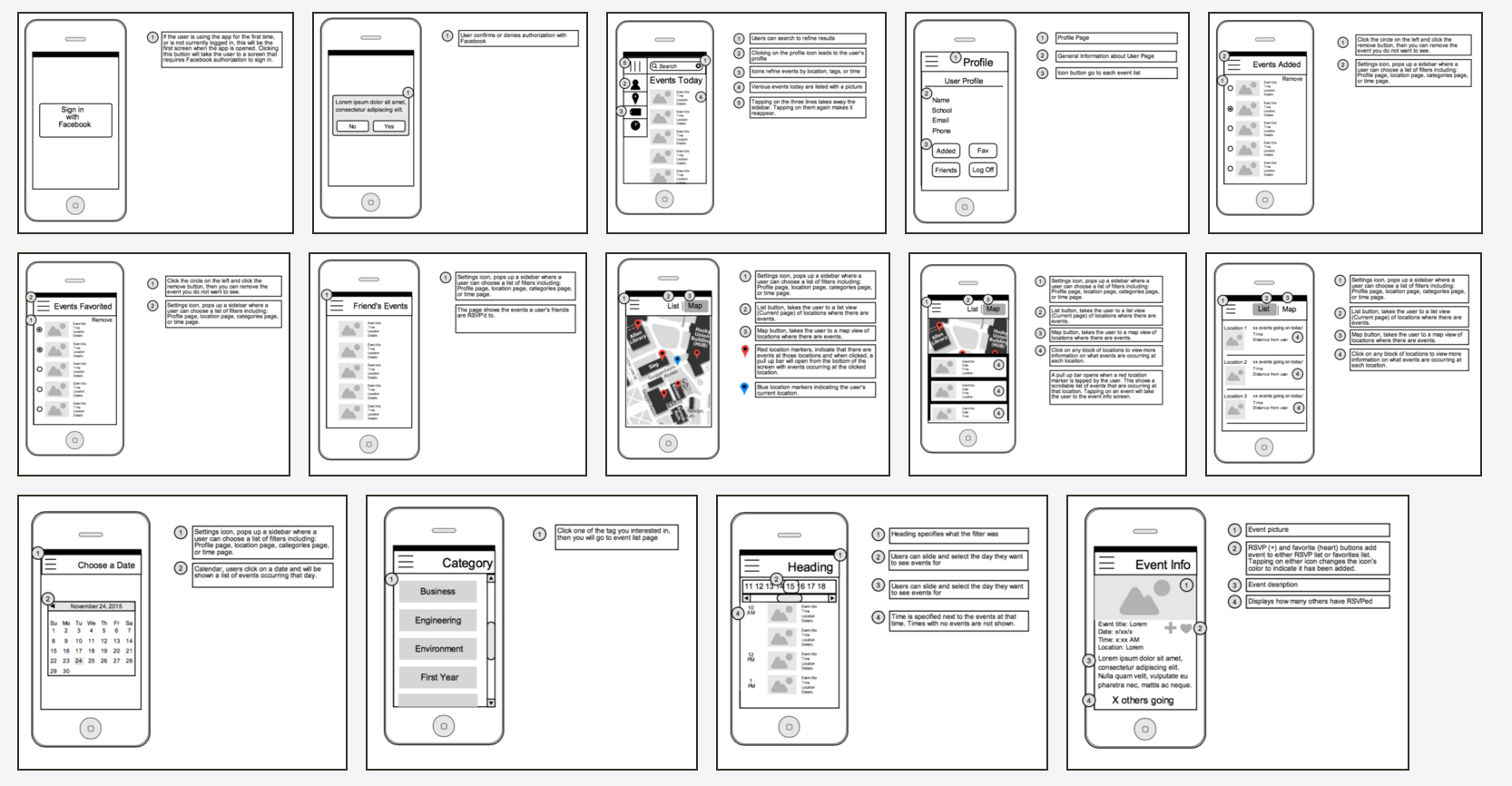
With our sitemap laid out, our group was able to divvy up the workload fairly and efficiently work on each of the screens needed for the paper prototype of our application. Based on the sitemap, we create low fidelity prototype wireframe.
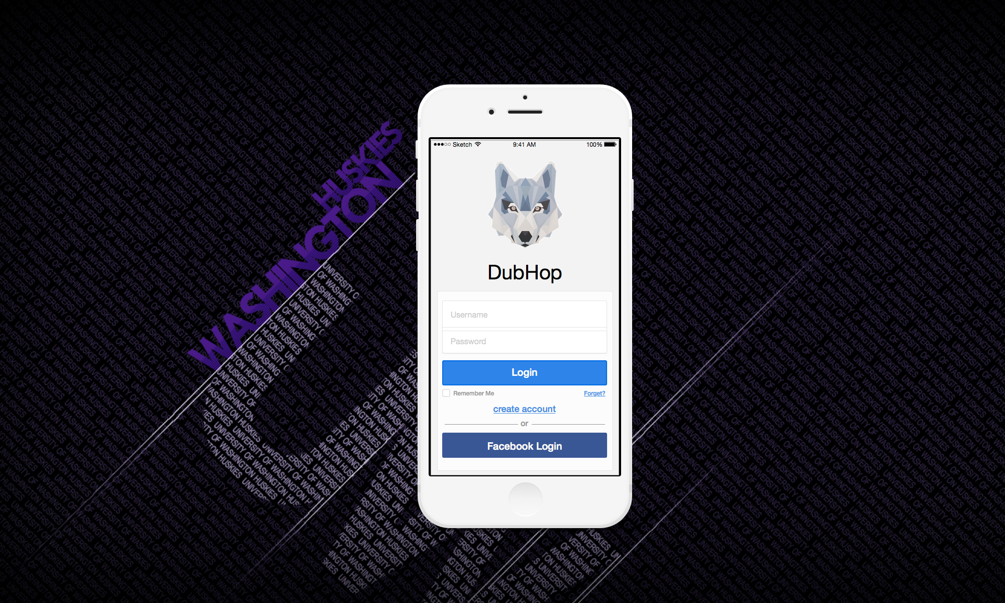
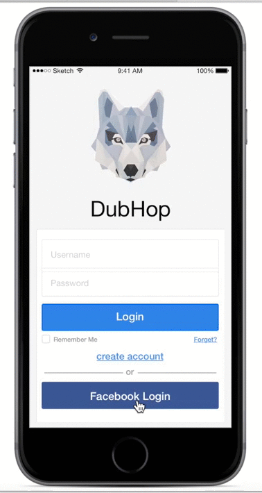
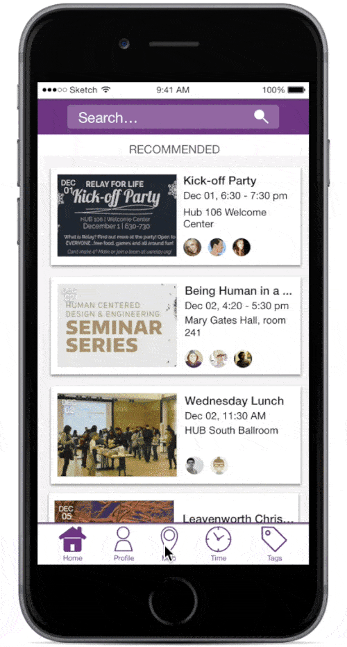
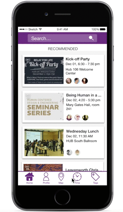
Hi-Fi prototype
With our sitemap laid out, our group wasUsing the wireframes as a template for each screen, we created our screens for our high-fidelity mock-up. This made it extremely easy and a faster process to create the screens as we knew where we wanted to display our information. Most of the time spent on the high-fidelity mock-up was on the user interface to improve the user’s experience. After creating this, we then presented it to more willing testers, and received further feedback. We finally scrapped the hamburger icon idea and changed to a bottom navigation bar to make it easier and more accessible for users to access the different features of the application. While completing our final high-fidelity mock-up, we constantly repeated the process of hashing out ideas, sketching them, creating a mock-up. critiquing, receiving feedback, and refinement.
Key Path 1
Create a profile and login with your Facebook account
Check Profile Page
Key Path 2
RSVP to any event at the HUB
Key Path 3
Favorite an event starting at 11 am tomorrow
See a list of your favorite events